 It’s somewhat satisfying whenever we wipe out the more uggo elements of the old UI in favour of newer, sleeker and more accessible systems. The Kingdom continues receiving love on all fronts, helped along generously by user reports which let us work out the kinks that much faster.
This week, we’ve been putting our work into the default Kingdom and map side panels, both of which have been in sore need of updating for quite a while. The obsolete information displays and quest listings have left the scene, replaced by stuff that’s easier to use and much friendlier on the eyes (our Kingdom Advisor panel will be making a return later in a different and much more impactful form).
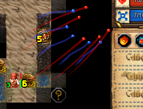
We’ve also managed to properly implement regeneration trails in-dungeon, which is a huge relief for us. As it turns out, teaching people about the marriage of exploration and regeneration is a rather thorough exercise in pulling teeth. Visually reinforcing where one’s health comes from – and where it ends up – is one of our most vital weapons in the war of understanding. Perhaps we’ll write a post sometime about common gamer expectations versus departures from the norm, because this issue alone has given us more pain than third-degree burns at a salt convention.
The radial menus mentioned in this week’s dev blog aren’t in the game yet, because we want to polish them a bit more (not much use giving people an alternative interface yet if it’s not 100% convenient to use, right?).
Aside from one or two changes which could be considered bug fixes more than anything else, we don’t really have much in the way of balance adjustment for you this week. Graphical improvement, however, marches proudly on. Changelog follows:
Fixes:
- Major kingdom panel overhaul.
- Fixed crash with reclaiming locker items.
- Explorer Guild interface cleaned up
- Fixed issue where locker items wouldn’t show after building upgrade
- Jehora now responds properly to B2P enemy reveals
- New animations for health and mana regeneration
- More status effect graphics included

